Jan 19, 2022 | Flooring Canada
It’s the moment interior designers wait for all year: the Pantone Color of the Year announcement. Pantone refers to itself as “The global authority for color communication and inspiration since 1963” and has been incredibly influential in a variety of industries thanks to its proprietary color-matching system. Every year, it forecasts a new color trend it believes will resonate in the year ahead. This year, it announced PANTONE 17-3938 Very Peri as the color of the year for 2022, and we are sure you can expect to see the shade show up in everything from furniture to décor to possibilities for your next floor.
.jpg)
Color Wheel Classic by Daltile
To better explain the deeper meaning behind the color, we turn to Leatrice Eiseman, Executive Director of the Pantone Color Institute. According to Eiseman, this borderline purple hue is great for expressing creativity and imagination.
“As we move into a world of unprecedented change, the selection of PANTONE 17-3938 Very Peri brings a novel perspective and vision of the trusted and beloved blue color family, encompassing the qualities of the blues, yet at the same time with its violet red undertone, PANTONE 17-3938 Very Peri displays a spritely, joyous attitude and dynamic presence that encourages creativity and imaginative expressions,” Eiseman says.
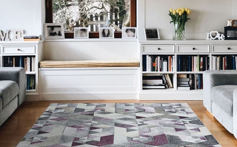
Prairie Falsterbo Byzantine by Couristan
After being confined to our homes for so long, the sterile nature of monochrome palettes and minimalism is out! More people are pivoting hard to maximalism with weird, whimsical, and wiggly décor pieces that are bursting with unapologetically fun energy. Very Peri perfectly encapsulates these changing attitudes, as it displays a daring curiosity that frames the future in a new light. Take this color into consideration when you find yourself looking to make a modern, colorful update to your surroundings at home.
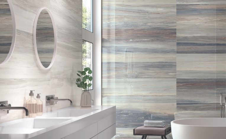
Kudos Indigo Rectified Glossy Ceramic Emser Tile
While Very Peri can seem overwhelming as a dominant color in your home, there are many ways you can use it to punctuate your space. Try using it on an accent wall or incorporating it into a wallpaper design. Still too much? You’re bound to see furniture pieces in Very Peri soon that could add the perfect pop of color. Maybe something in between? Consider border tiles or a backsplash that features Very Peri.
.jpg)
If you want floors that scream 2022, your best bet is tile, carpet, or luxury vinyl since those can be manufactured in any color. But if that seems too intense for a floor color, you’ll want to shop for complimentary floors by focusing less on the color itself and more on the attributes of the color –paying attention to charm and personality – that make it perfect for 2022. No one truly knows what this year will bring, but we hope that Very Peri inspires you to stay creative, embrace new possibilities, and reinvent yourself and your home along the way.
For more of the latest interior design trends and inspiration, check out our latest issue of Design at Home by Flooring America.